
INFO
What is DVLP?
BACKGROUND
What are the expectations?
From Basketball Camps to creating Digital Athlete-Coach Connections
DVLP initially originated as a basketball camp and training enterprise from Omaha, Nebraska. Their vision was to enhance their offerings by introducing an inventive platform designed to create connections between athletes and resources, all while equipping trainers with the essential tools to efficiently oversee and expand their business in the digital form. This digital solution provides athletes with access to a carefully selected roster of seasoned basketball coaches, enabling them to elevate their skills and performance.
A Focus on Enhancing Trainer Experience
Our client's primary objective was to direct our efforts toward enhancing the trainer side of the application. They tasked us with conducting a comprehensive design audit and revamping the app's overall aesthetic and user experience.
ROLE_
UX Designer / Researcher
Project Manager
TIMEFRAME_
3 Week Sprint
TEAM_
3 People
DVLP
Shaping the future of athlete-coach connections
PROBLEM
The original state of the app is diving too far in to features without any clear Goal or Hagiarchy…
which is causing confusion in users and leaving them puzzled as to what the purpose of all the features are.
SOLUTION
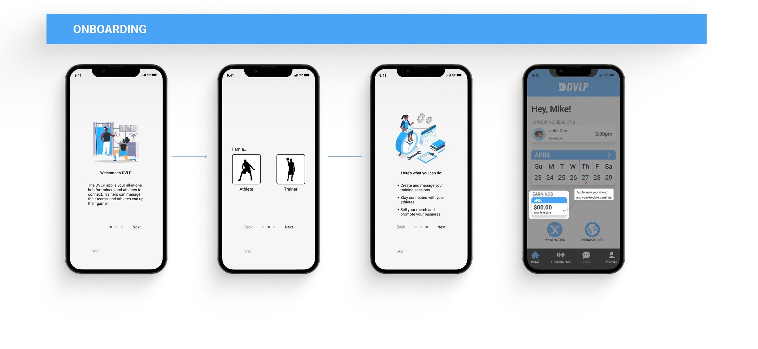
Create a better structure along with hand rails in the beginning
We decided to create a better structure, focusing importance to the key features of the app instead of having them tucked away, along with an onboarding sequence to provide context and instruction on how the app works.
Why are we doing this?
1_ Unraveling the features
We came to the understanding as a team that the current state of DVLP was unorganized, and seemed like a last minute attempt at fitting features in to the crevasses of the app.
3_ Bringing back the vision
Before out team got to work on what was DVLP, we saw the initial vision the previous design team had planned for it. It seemed as if implementation had some issues along with the design team over doing a lot .
Fused Sports
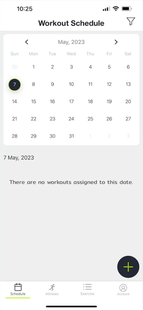
The calendar feature is used as the homepage, with the ability to see upcoming events below.
100%
had a positive
response
DVLP
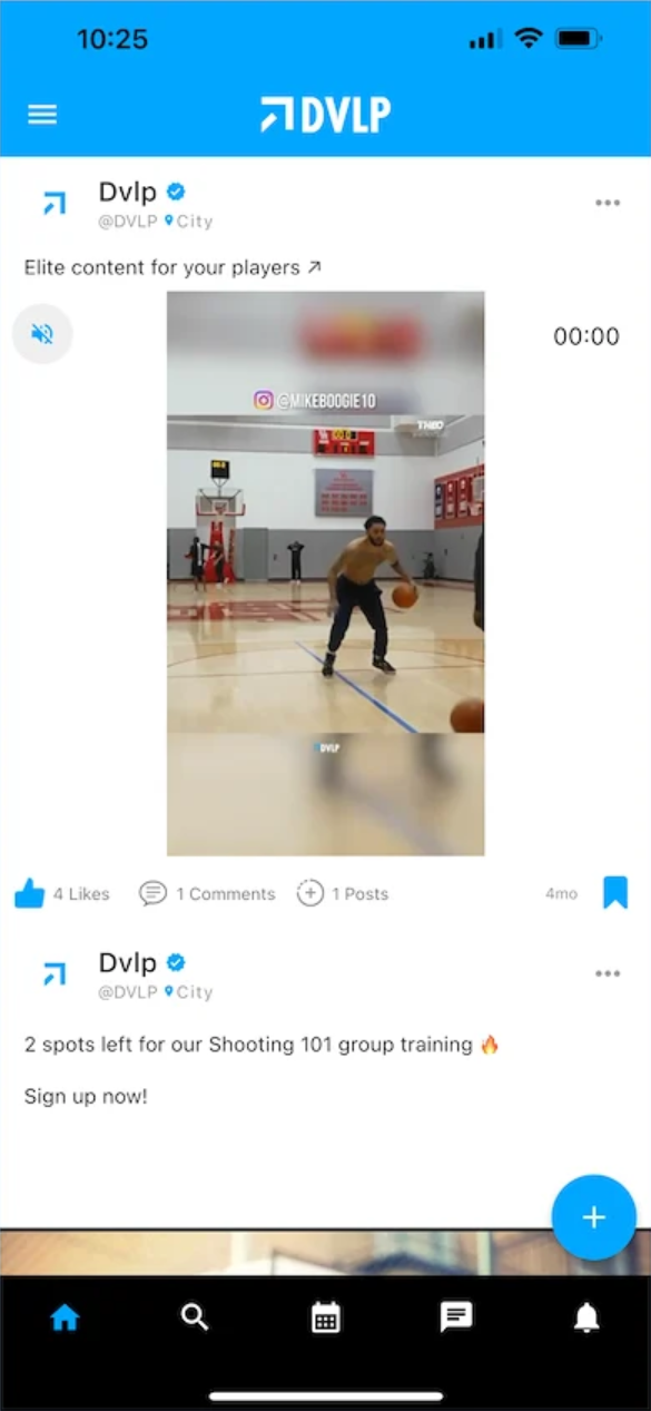
landing page is organized to feel like a social media platform.
100%
Trainr
The user is dropped in to a dashboard like landing page with key features labeled for them.
Utrain
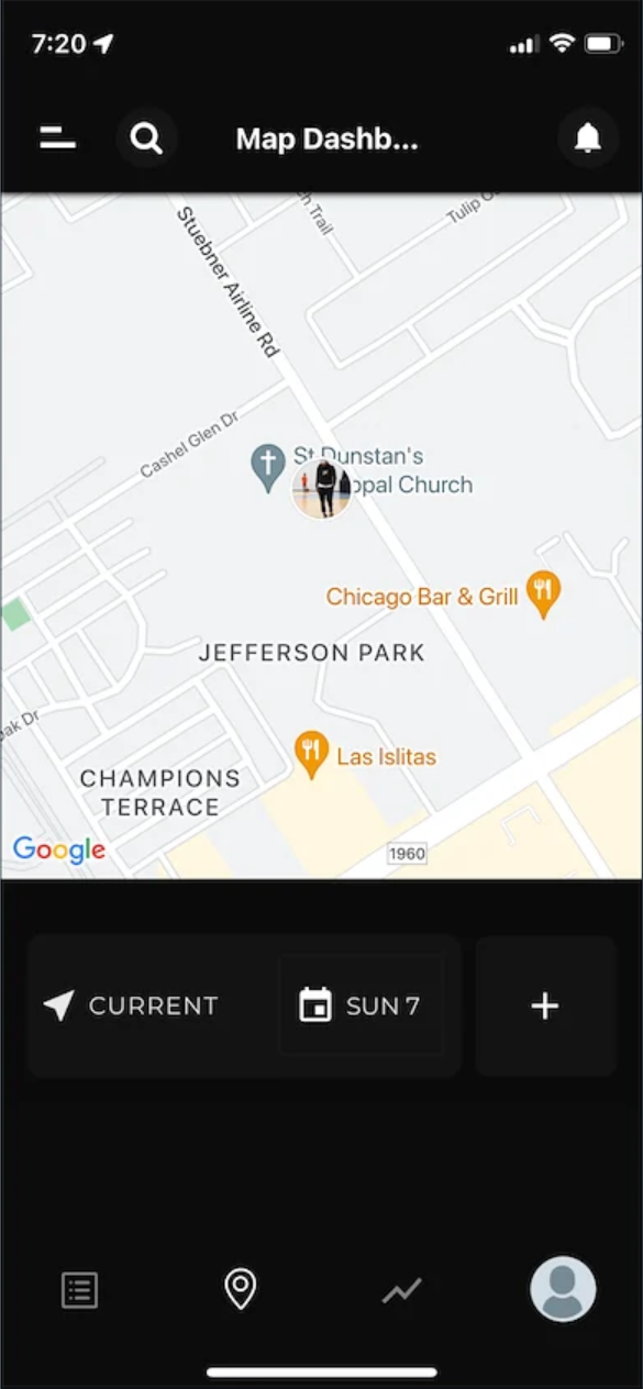
The landing page is a map view where users have access to where exactly trainers and athletes are located with the ability to connect with them.
Understanding the the current state
UNDERSTANDING THE PROBLEM
2_ Guiding the attention back to Athletes And Coaches
with our own observation and the results from the usability tests to back our claims, we saw the focus point of the application was not clear to 80% of users.
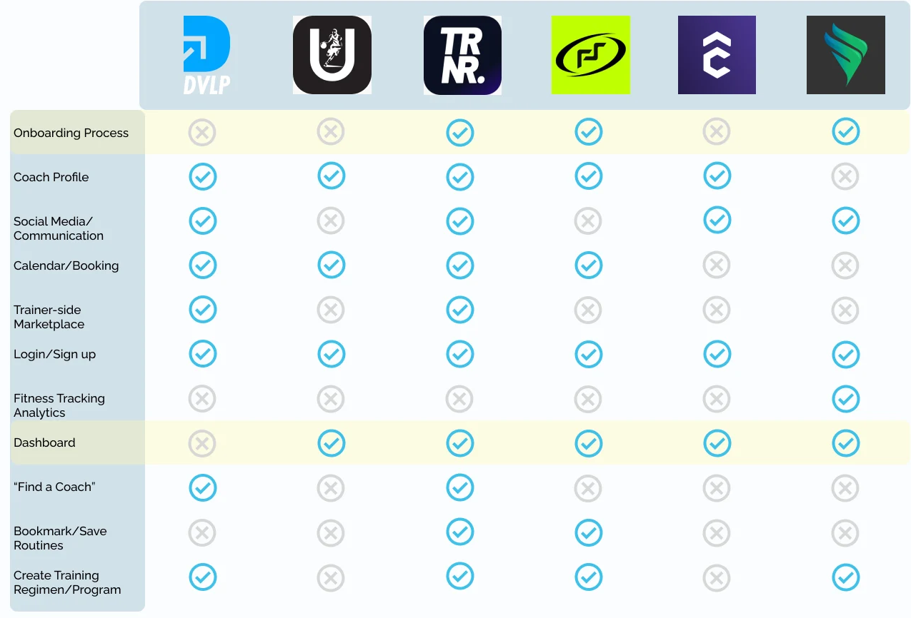
In order for us to fully understand the flaws in the current app we found 5 direct and indirect competitors. Some of these applications did things better and others did some worse, our team was precise in choosing aspects that would only be in our users benefit
When first time users got on the original app, they were immediately left hanging after signing up as a coach or athlete. This leaves the user to draw up conclusions that the app is more of a social media/ motivation app.
After re organizing and filtering the large amount of filters together, we then re structured the information architecture of the entire app. after we conducted usability tests on our new lo-Fi prototype to assure that everything was within user standards we realized that there was only a couple finishing touches needed.
Adapting to the change
KEY OPPORTUNITIES
100%
We recognized a significant difference between DVLP and our competitors, specifically the absence of a dashboard. To address this gap, we conducted an in-depth examination of dashboard features to guide our design decisions for the incorporation of this new screen.

Had no issues
going through sign up and login
KEY INSIGHTS
•100% had some kind of dashboard for the trainer side of the app.
80% included an onboarding experience
DATA AND METRICS

asking users to create profile ( within 2 minutes w/ no error)
Having users set up a training session (within 3 minutes )
Seeing if users will be able to create custom digital courses (within 3 minutes)
Along with post questions, you can see more here
We Scheduled a couple meetings with the stakeholders in order to discuss the idea of moving the social media aspect in order to cater to the front and foremost issues users were experiencing. What we were not expecting was the immediate green light from the stakeholders without any push or give.
After discussing the changing of the social aspect, our team also wanted to discuss the state of the hamburger menu and how we imagined it should have been organized instead. Again they agreed without hesitation and we got to work.

Social media in the grand scheme
ITERATION 1

ITERATION 2
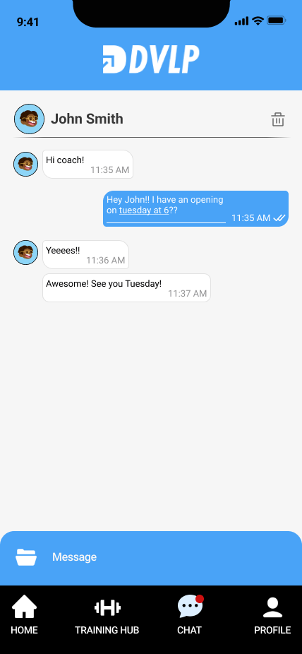
After implementing the new dashboard, we used the target user groups' interview results and personas to flesh it out. Most of the work on the dashboard had already removed the clutter from the hamburger menu. All that was left were the little things. We were able to flesh out almost everything, including the chat and event creation features, which were definitely in need of a refresh.

The Finished Product

In order to ensure consistent results, we employed the same interview participants for evaluating the usability of the new app design. We conducted a series of tests with six participants, where we asked them to perform tasks within the app to gauge its intuitiveness. The questions posed during the tests encompassed..